


But don’t worry if you have a hard time understanding that confusing three-dimensional chart above. Color’s a lot easier to understand in sections, and that’s how we’re going to be looking at it.
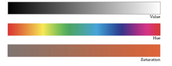
Color has three properties or “sliders”, to play with: value (how light or dark a color is) hue (like red, green, or blue; this is what people normally mean when they say ”color”), and saturation (how bright or dull a color is).
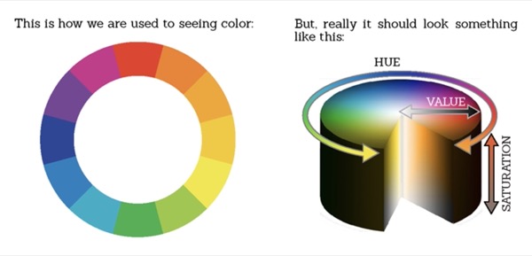
They are often depicted like this:
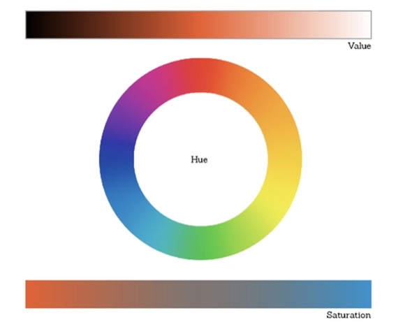
and that is a pretty good representation, but I prefer to think of them a little differently:
“Why?” you might ask. Well, that’s exactly what I intend to explain to you! However, color is a very big and exciting topic, and as much as I tried, I couldn’t fit all the tips and ideas I wanted to share into one tutorial (at least not one of reasonable length). So this one is going to be a four-parter! Part one will be on value, part two hue and saturation, part three color-picking, and part four will cover my digital coloring method.
Value
I know, you probably know a lot about value already, and it’s a lot less exciting than color; but value is part of color, a very important part of it. That’s why I like to see it like this

Instead of this

And believe me, you’ll want to know about value if you’re planning on making color work for you. Value can make or break a composition in a way that can’t be made up for by the other color properties. Let me show you.
These are kind of fun, happy colors, right?

Not if their values aren’t working!

Value establishes the underlying tone, readability, and rhythm of a piece of art.
Tone
A lot can be communicated about the underlying story or feeling of a piece simply through value.
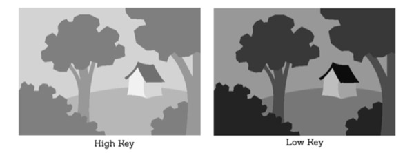
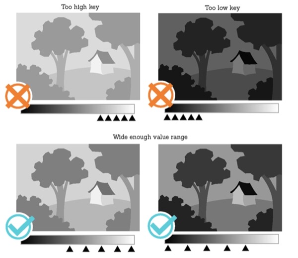
A high key piece (high on the value spectrum) uses a lighter range of values, and tends to feel happy or peaceful. A low key piece, on the other hand, is made up of darker values (low on the value spectrum), and often feels heavy or intense.
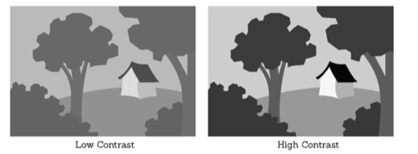
The amount of contrast between values in a piece can also communicate a mood or story. Low contrast feels safe and mellow, while high contrast feels more dynamic and exciting.
When creating a piece take a little time to decide the tone that you want your values to communicate, but don’t get too extreme or you’ll lose readability. Speaking of which…
Readability
This is super important! Assuming you aren’t making abstract art, it doesn’t matter what the colors of a piece feel like if you can’t tell what’s going on. In readability, value contrast is king: if the contrast is too low everything blends together, but if it’s too high the piece doesn’t read as a whole, shapes are taken out of context, and the subject can be misinterpreted.
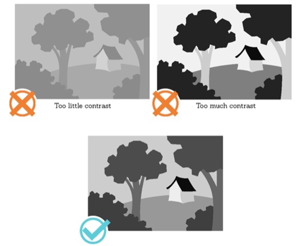
The goal is to strike a happy medium where things are easily distinguishable, but don’t compete with each other. You can do this by spreading your range of values evenly through a reasonable length of the spectrum.
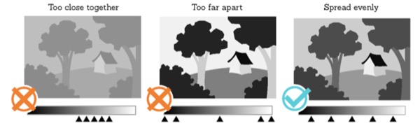
This is why you also want to be sure not to get to extremely low key or high key. Grouping all your values on one side of the spectrum puts them too close together, and eliminates contrast; choosing a wider range will give your values the space they need. Rule of thumb: always use more than half the spectrum (that half can also be located in the middle).
And remember, value is a property of color. Be very careful not to confuse it with any of color’s other properties. Although each hue has a full range of values, some have an inherent lighter or darker midrange than others.

For example, blues are typically darker than yellows
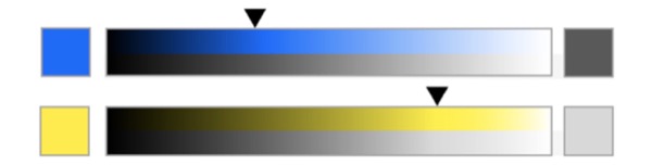
But this isn’t always the case. These hues just look a lot more like themselves within their typical value range.
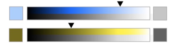
So be conscious of where you’re using them, because if you want a house to really read as yellow in your painting…
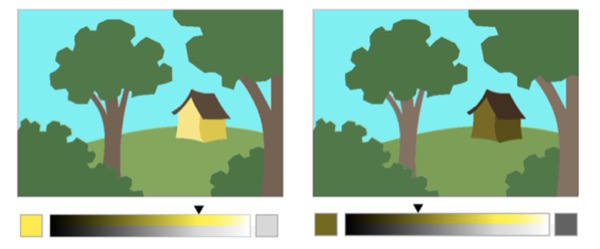
It’s probably going to need to be on the lighter side of your value range.
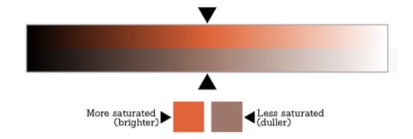
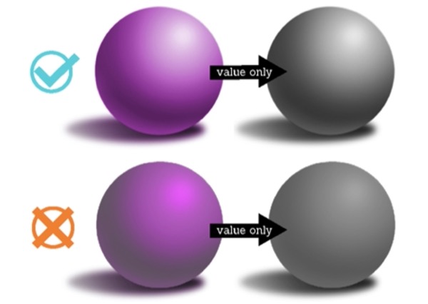
Saturation can also be deceptive when working out values. It can make a big difference in color, even when the value and hue are the same. For example:
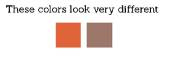
But they both have the exact same hue and value, the only difference is saturation.
As artists, most of us have been taught at some point to add black to a color to make it darker and white to make it lighter, but this isn’t necessarily the most effective way to work with value. Adding a light-valued yellow to a red will lighten it, and adding a dark-valued blue will darken it, much in the same way white would lighten or black would darken.
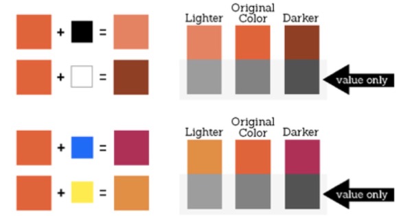
The difference is that adding a color shifts the hue, but keeps the color nice and saturated, while adding black or white lowers the saturation, and because we’ve been taught to use black and white to lighten and darken, it is easy for us to mistake a difference in saturation for a difference in value. For example:
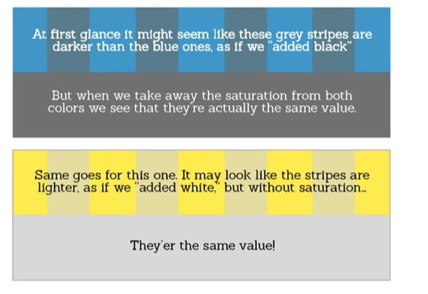
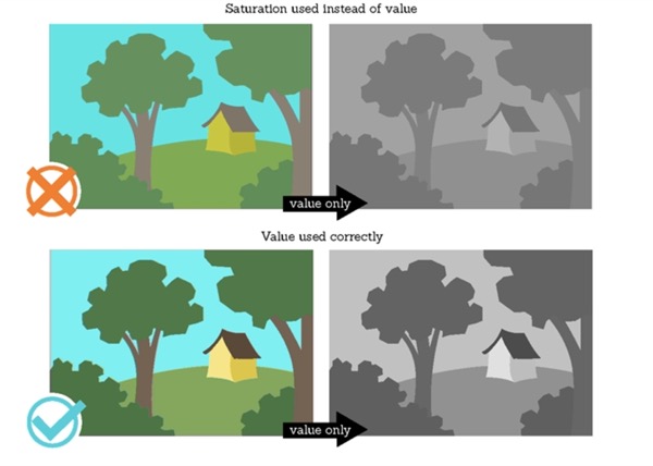
Saturation used in place of value will look awkward and fatigue the eye because it’s trying to separate colors that appear different, but are actually quite similar. This may produce an annoying sort of blur or vibration where the colors meet and your eye can’t decide whether it’s looking at one shape or two. It can be difficult to retrain your eye to this, but it’s worth it!
Rhythm
Value contrast also determines the rhythm and focus of a piece. The strongest (lightest and darkest) values in your piece will naturally stand out against the midtones, and it’s important to be purposeful about where you put them. For example:
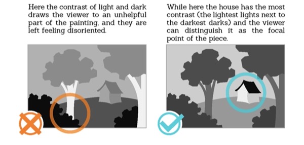
The way you spread out your strong values within your image is also important.
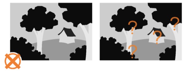
If they’re repeated too often there will be too many points of high contrast and the viewer won’t know where to look.
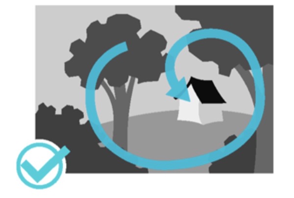
Points of contrast can also guide the viewer’s eye along a visual path. If you use this correctly you guide them through the piece and keep them looking at it.
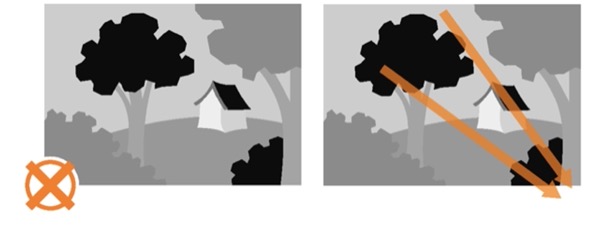
But if you’re not careful you can actually lead the viewer’s eye away from the focal point, or even right off the canvas!
And, last but not least, make sure to be careful not to group all your values on one side of the piece. It can visually cut the piece up in a way that’s not very appealing.

However, you can use value grouping to your advantage. If you’re purposeful about it, it can be yet another tool to help guide the viewer’s eye.

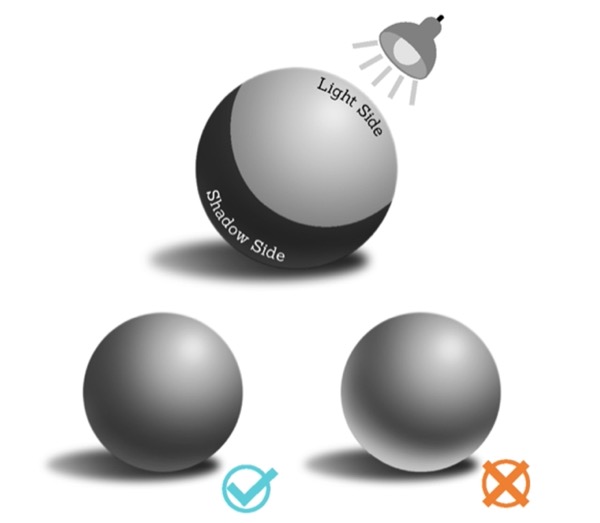
Light and Shadow
Another important aspect of value is that it communicates light and shadow.

You’ve probably seen this guy before. Here’s a recap of what he’s about:
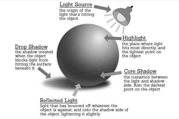
This is all about showing how light interacts with whatever object you’re drawing or painting, which could be anything from a toaster to the human figure. Getting this right will give your piece a great feeling of three-dimensionality.
It’s important to remember that, unless the object is metallic and highly reflective, even the lightest value in the shadow side is darker than the darkest value of the light side.
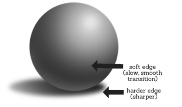
Another good thing to keep in mind is that the transition between the light and dark side of an object is typically best depicted with a soft edge, while the edge of the cast shadow should be harder and sharper by comparison.
And remember not to confuse value with hue or saturation!
You can use light and shadow in a composition in two ways:
Every object has a local value that it would be if the lighting was disregarded. If you want, you can keep your shading minimal, and plan your piece around these local values.
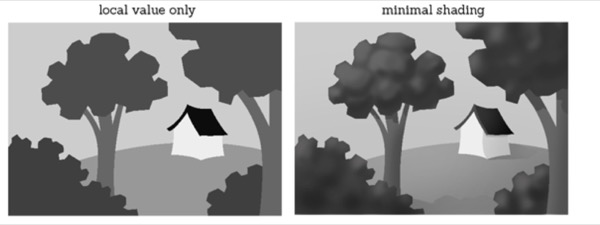
Here the light source is pretty general and indirect. This keeps both the shadows and highlights mild, and lets the local values determine the values and contrast for the finished piece.
Or you can use more dramatic lighting, and build a whole new value pattern that isn’t affected all that much by local value.
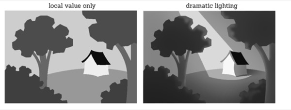
Here the values and contrast of the finished piece are determined by the lighting instead of the local values of the scene.
Both are perfectly good ways to compose a piece; but whichever you choose, keep in mind the value patterning tips we talked through earlier. They’ll help your piece to be readable and appealing.
These basic tools should get you pretty far if you can master them; and remember, experience is the best teacher! Look at pieces by your favorite artist and photographers, and break down their value patterns. Look for the dynamics of light and shadow in real life. Figure out what direction the light is coming from and how the highlights, core shadows, cast shadows, and reflected light fall in response.
Remember to draw or paint what you see. Practice makes perfect!
I hope you found these tips and tricks helpful. If you like them and want to know more, you can take a look at my other tutorials in Sketch a Day.
Thank you for reading!