

Now that you’ve got value under your belt it’s time for hue! This is where things get really fun - or frustrating. But have no fear, if you get some basic skills down you can make it work for you.
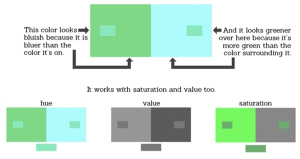
The first, and possibly most important, rule to remember is that color is relative: in other words, we see colors differently depending on what colors they’re next to. For example:
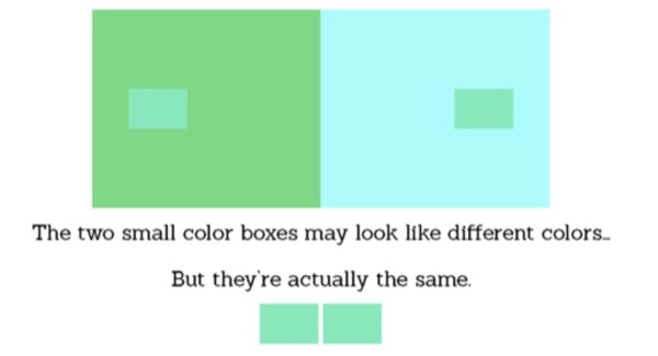
On the other hand, these two greyish boxes look like they’re the same color.
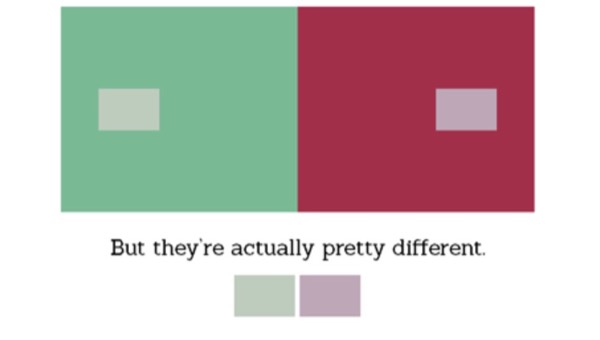
This stuff happens because our minds determine color by comparison.
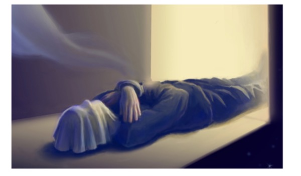
This is how you know that the corpse in this painting is wearing a black suit and has a white handkerchief over its face, even though both are painted in blues and yellows.
Artists use this all the time, and it’s very important in painting. Let’s take a look at how.
HUE
First, let’s get on the same page with vocabulary:
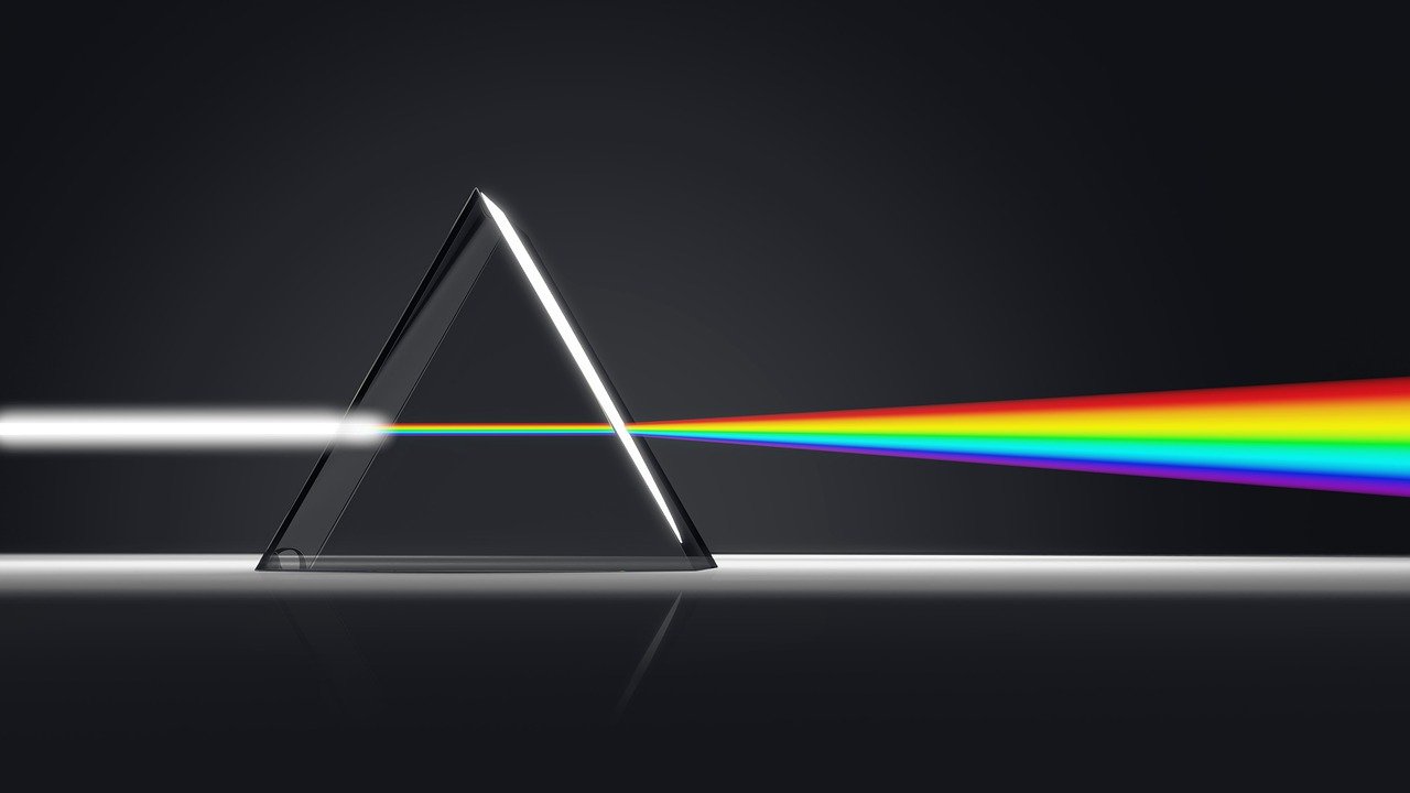
Hue is where a color lands in the spectrum of visible light, which is a fancy way of saying it’s where your color sits on the rainbow regardless of its value or saturation. Reds, greens, blues, yellows, etc.; they’re all hues.
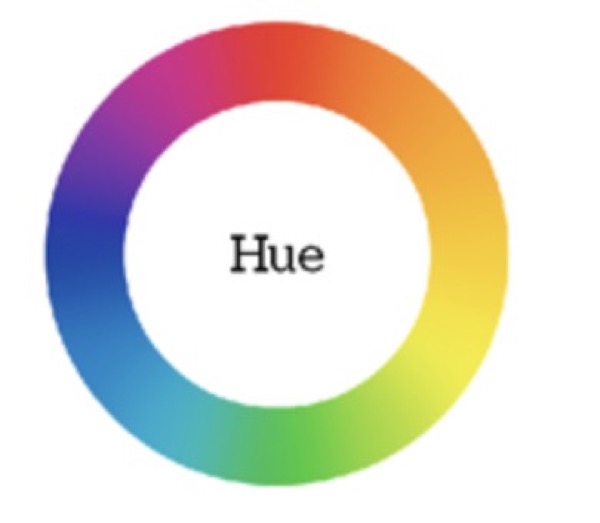
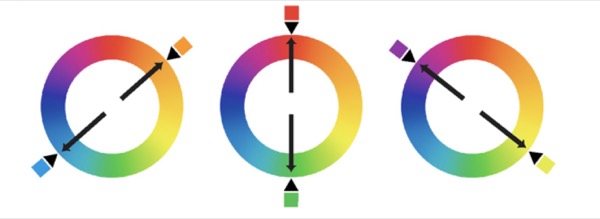
Each hue has an opposite on the spectrum, called a “complement”. One of the reasons I prefer to think of color as a wheel is that it makes it easy to pick out these complementary hues.
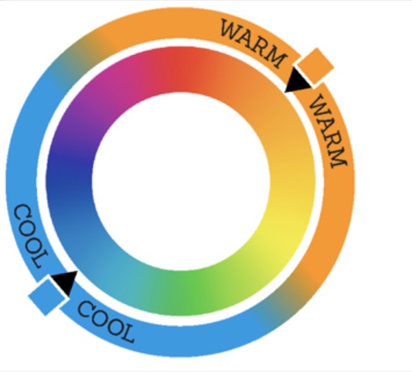
Hue is normally classified by temperature. Cool hues include blues, greens and some purples; they are reminiscent of cold objects and settings.

For warm hues think fire colors. They are your yellows, oranges, reds and sometimes magentas, and they tend to suggest heat and life.

Everyone has a slightly different opinion on exactly which hue is the warmest and which is the coolest. From my point of view, blue is the ultimate cool, and orange (which is blue’s complement) is the ultimate warm. And all the other hues exist somewhere in between.
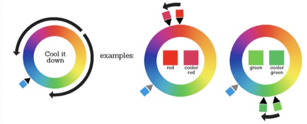
To warm up a color, simply move a few steps closer to orange!
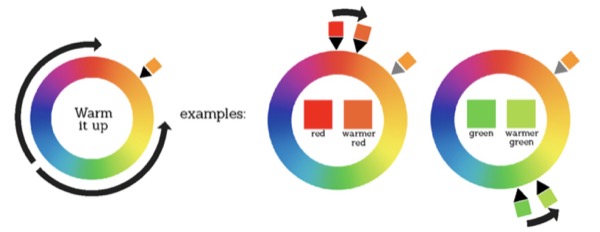
Or to cool a color down, move a few steps towards blue!
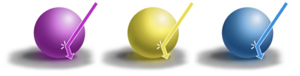
Okay, now that we’re on the same page, here is a purple ball:
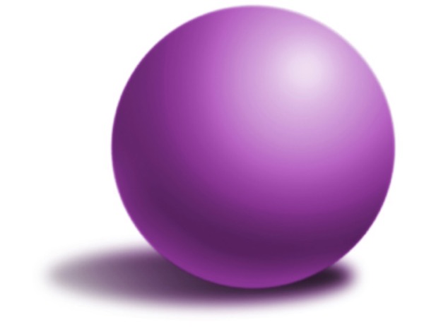
It looks okay, right? The values are fine and everything, but it feels a little boring. Kind of dead.
This is the way that most beginning painters start off, using color “straight out of the tube” and mixing with black and white to shade, which makes a lot of sense if you’ve been working mostly in grayscale with pencils and charcoal; but in the real world, color is a lot more exciting and alive. There’s more to it than just “this ball in purple.” Even a simple scene can have dynamic color.
Light temperature
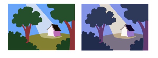
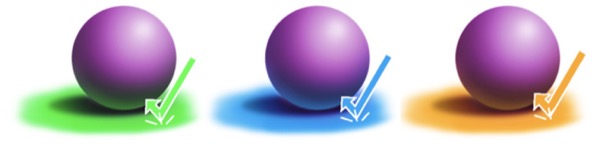
For one thing, objects and surfaces are not the only things that have hue - light is often colored too! One way to really get the color in a painting to start working for you is by following the warm light, cool shadow/cool light, warm shadow rule.
When the light source of a painting is warm the light side of the object it’s hitting will be influenced by that warmth, but the cast shadows and the shadows side of the object won’t be, and so it will look cool by comparison. Emphasizing this color difference by actually cooling down the colors in the shadows can make a painting really pop!
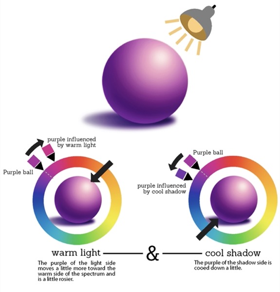
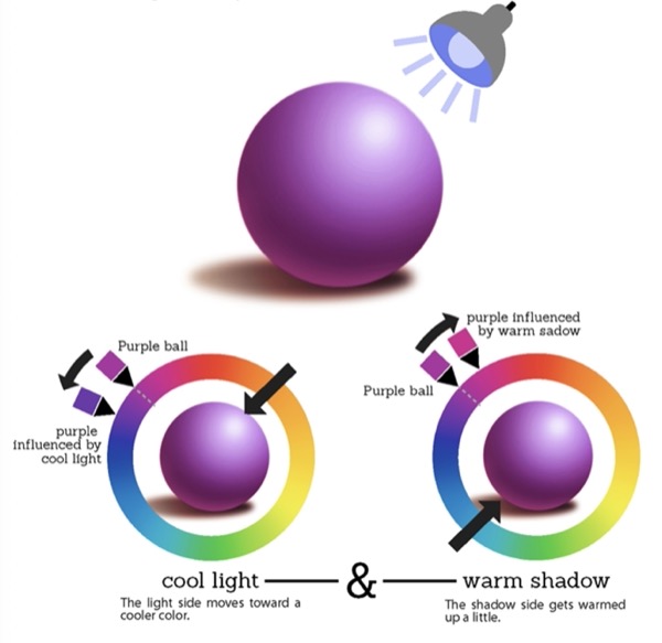
And for a cool light source just invert it!
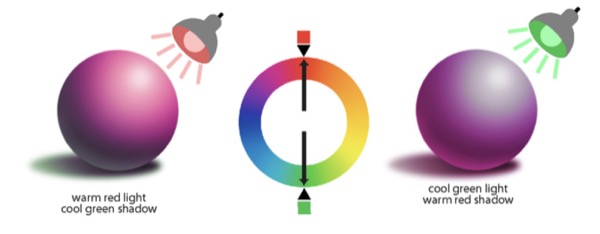
These two examples are based on light in the orange and blue hue ranges, but this whole idea is based off of color relativity and complementary hues, so the same general principle of keeping your light side influenced by one temperature and your shadows influenced by the opposite works on pretty much any hue of light. For example red light (warm) or green light (cool)
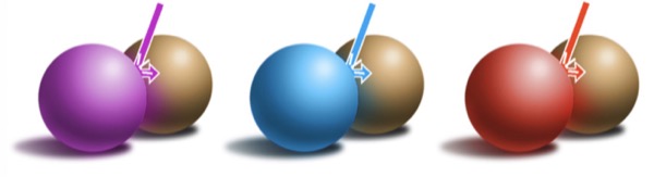
Using colored light can really bring a painting to life.
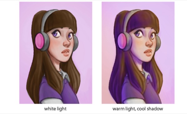
It can even help unify a scene when the local hues of objects aren't working well together, because you are using the same two colors to influence everything in the piece.
Reflected Color
Another way to bring life into the colors of your painting is to remember and look for reflected color.
The physics of light can get pretty complicated, but here’s the simplified version:
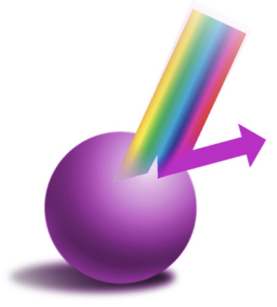
Every object absorbs a certain amount of light from the visible spectrum and reflects everything else. We see objects as the colors that they reflect.
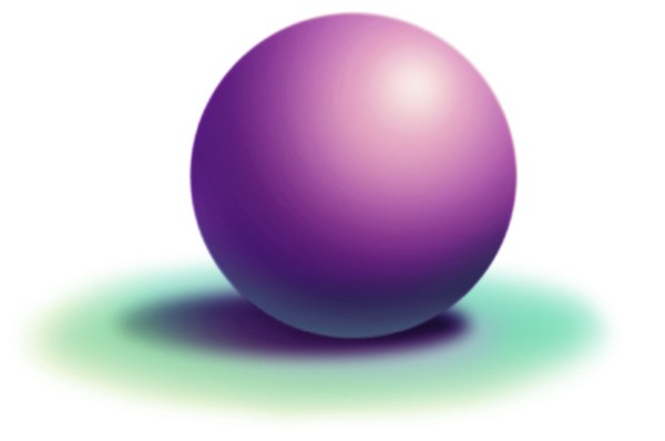
So our purple ball will absorb the hues on the spectrum that aren’t purple, and reflect the blue and red hues that combine to make purple.
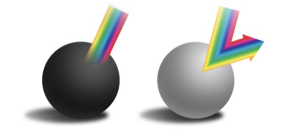
Black and white are our two exceptions to this. Black absorbs all the hues in the spectrum and reflects none; while white absorbs none of the hues but reflects them all.
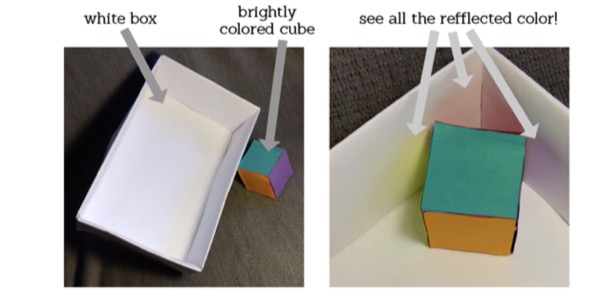
But because of this, brightly colored objects will often throw reflected color onto objects that are close to them.
So an object can reflect its color on to a surface
Or a surface onto an object
Or one object onto another object.
The result can be pretty dynamic. If you don’t believe me, try putting a brightly colored object in a white box and see what happens.
And exaggerating it a little can bring vibrance to a piece.
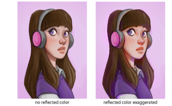
Just be sure that you don’t mess up your values: the lightest color on your shadow side should still be darker than the darkest color on your light side.
That wraps up our course on hue! I hope you learned a few things. Of course, hands-on practice is the best way to really get a handle on this stuff. Try mixing colors both by hand and digitally. Experiment and try to use the principles you’ve learned here to break apart what’s going on. Look for colored light and reflected color in the world around you. Try to see how the artists you love use it in their work. And of course, remember to paint what you see. Practice makes perfect!
I hope you found these tips and tricks helpful. If you like them and want to know more you can take a look at my other tutorials.