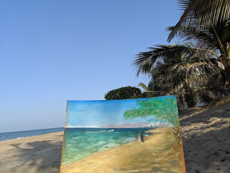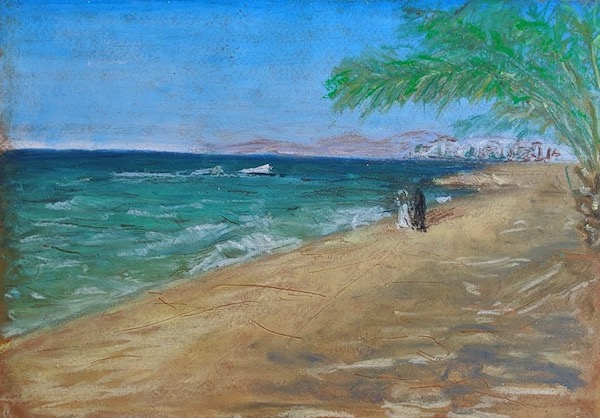

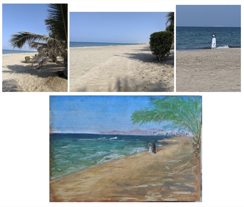
This is a little beach scene. Its drawn with Mungyo Oil pastels on A4 Seawhite Paper with Senellier pastels on top. You can’t see the mountains in the background of the ref photos, but they are there (just).
Step one - underdrawing
This is a fairly straight forward picture. There aren't any lines that you need, just draw in the horizon and shoreline with a pencil.
Step Two - Prepare the paper
Then coat the Sky with a medium. I used Sennelier Transparent medium. This makes the pastels glide more easily.
Alternatively, you can use a bit of solvent if that’s what you have available (this can be applied either under the colours or over the colours when you blend, both work equally). Sadly my solvent couldn’t come on the plane with me.
If you don’t have either, don’t worry, it will still work I often work without medium and still get beautiful results. You just might need to add an extra layer of colour that’s all.
Step 3 - Sky
The sky isn’t really blue. It’s ‘Cyan’ a slightly greenish blue with some white mixed in. Its darker at the top and gets lighter to the bottom - at the horizon almost becoming white. The very top of the sky has a little bit of a warmer blue.
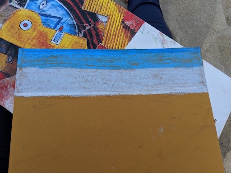
Paint a very very narrow line (1/2 cm) of warm blue at the top (eg ultramarine or sapphire blue). Then draw a cyan colour to make the top half of the sky blue (I’ve used ‘Light Blue’). Colour the bottom half white.
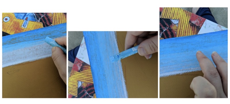
Next add a lighter (and greener) blue over half the blue you already have and about 80% of the white. Pressing lighter as you move downwards (so the white shows through the closer to the horizon you get).
Now for the fun part! - blend it with your fingers :) If you’re using solvent, you can add that here to make the colours blend more easily.
Step 4 - Sea
The sea is the opposite of the sky. The darkest part is closest to the horizon and the lightest is closest to you. In some climates this isn’t the case, in the UK it tends to be hazy so the line between the sky and the sea is imperceptible. However, in this location, there is a very distinct dark sea at the horizon, getting greener and lighter in value the closer to you it gets.
As with the sky, prepare the sea area of the paper with a medium if you’re using one before applying the pastels.
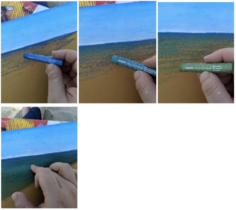
Start with a red blue like ultramarine - I’ve used Sapphire blue, then paint the sea using gradually greener shades of blue. I’ve used Malachite Green and Moss Green. Overlap the colours as you will be blending them. Once the area is all covered, you can blend them (use solvent if you want to).
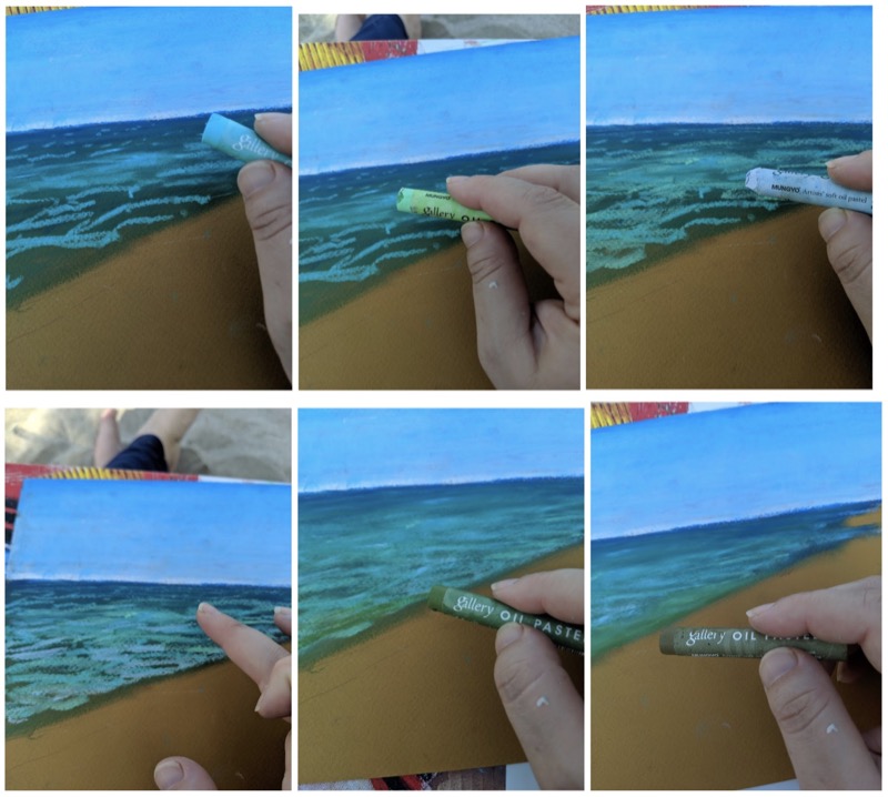
The sea isn’t all one colour. It has waves and textures in it. So add in a variety of different shades of green, blue and grey to the water, blending and mixing as you work until you’re happy with it. Remember the waves closest are biggest and farthest are smallest or non-existent. So you need bigger strokes and more of them closest to the shoreline, and barely any and tiny marks nearer to the horizon. Also the water is bluer to the horizon and green (almost brown) near the shore. Blend it much more heavily closer to the horizon than close to the shore. We want to keep some texture near the shore.
I’ve used Turquoise Green, Lime Green, Light Grey, Moss Green and Olive Brown, but use the colours your set has.
Step 5 - Sand
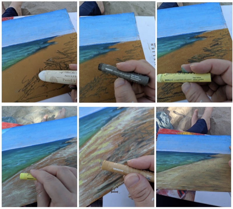
Here the shadows are on the right hand side (under the trees when we put them in) and the light is close to the shoreline.
Add the shadows first. Use a darker colour than you think you’ll need because this will be blended down with a ‘sand’ colour over the top. I used ‘Brown’ and ‘Raw Umber’. I forgot to add the medium before adding the Brown so I added it after. These shadows are the closest thing to the viewer, so the marks will be bigger and bolder than the water. They’re also more irregular so it’s more like scribbling (so fun!). Then cover the scribbles with a light sand colour (I’ve used Pale Yellow) add a warmer yellow for the areas that catch the sun (I used Lemon Yellow) and a dark sand colour for the shadow area (Ochre). Blend it with your fingers.
You now have a basic seascape. Now let’s make it interesting.
Step 6 - Waves
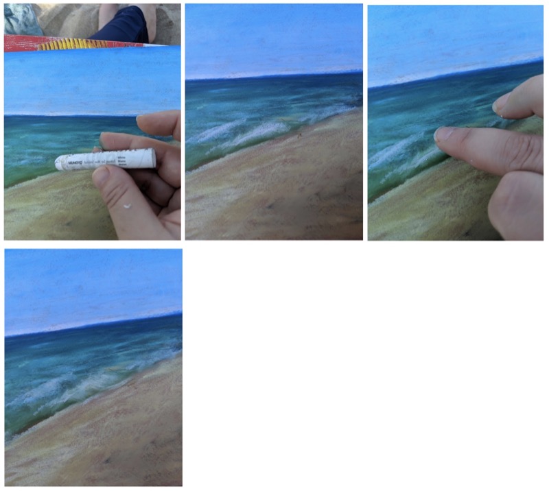
Using a white oil pastel, draw triangles along the shoreline. The wave doesn’t crash evenly. It breaks on one side before it does on the other, making a triangle shape. Then use your finger to pull the the paint down to make it look like water crashing.
Step 7 - Hills
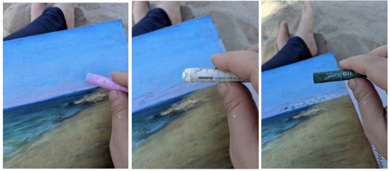
The hills are very far away. In the photo reference you can’t even see them! So you need a pretty light colour and you don’t want to press hard. Use a light pinky/purple colour, I used Light Purple Violet with white blended over it to lighten it further and suggest buildings. I added some Malachite Green to gesture where there are trees and windows. As the buildings are far away the windows are not black (that’s too dark for something so far away) and you don’t draw in individual windows or trees, you can’t actually see them.
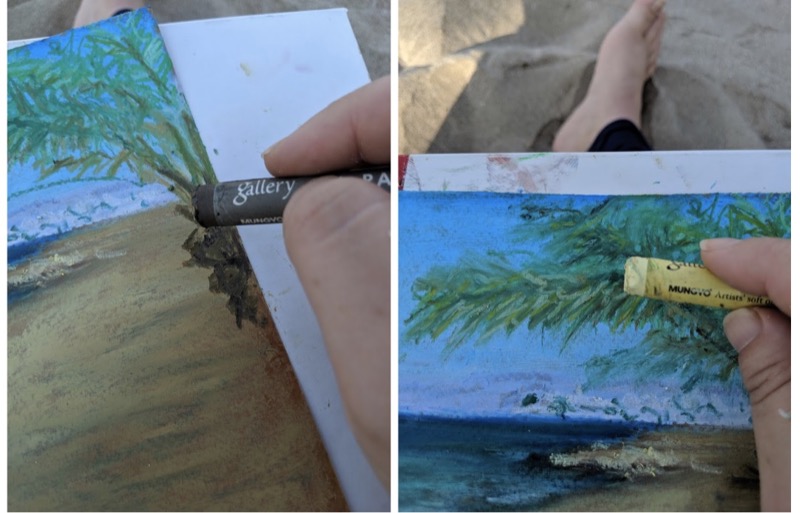
Step 8 - Palm Tree
This is the closest thing to you. So has the most detail out of everything you’re drawing. It is also where you inject a bit of your personality. Add several layers to make the tree stand out and look really close.
However you still don’t draw each leaf. I draw scribbles or blobs for leaves. The direction of the scribbles depends on the kind of leaves. For a palm tree, there are lots of lines (less blobs).
The ‘Branches’ travel vertically (with a small curve) at the centre and arch downwards on the sides. They are darker and ‘greener’ closer to the trunk and lighter and ‘yellower’ closer to the the tips.
The leaves are lines which hang downwards from the branches. They taper at the ends. The leaves in shadow are darker green and the closer ones are basically dying so are yellow and dry (or they are catching the light and are also yellow). I basically used all the dark greens in the box, Pale Yellow and Ochre. Start with the darker colours, and work lighter as the highlights go on the top. I kept scribbling until i’m happy.
The Trunk is a series of blobs of different shades of brown, with some Ochre for the highlights. Draw your blobs with a series of downward strokes.
Step 9 - Finishing touches
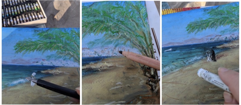
I like to scrape my work back a bit to give it a bit more character. It is also a nice way to get some of those lines you I can’t get because pastels are too thick. I have used one of these tools - i’ve no idea what it’s called. I found it in a foil scraping kits you can buy in the art store. One of those ones where you scrape off black paint to reveal the foil below it. You can basically use anything, I sometimes use my mechanical pencil, or palette knife which both work well.
I also use a colouring pencil. This removes the thicker pastel but also adds some lines in too.
Basically draw in some waves, some lines etc a bit randomly. Use these though to indicate perspective. Closer things have big scratches, further ones have small ones (or none).
When I was working I saw a couple of speed boats sail past and a man walking along the beach in his beautiful immaculately pressed ‘Thawb’. I’d also seen the night before some couples taking a romantic stroll along the beach. I’ve added these to the picture because to me they were a part of the essence and character of the place I was drawing.
For this part, I switch to my Senelier oil pastels. These are much softer than Mungyos. Whilst they can be used to do a whole picture they tend to apply quite thickly which means you’ll get less layers. They are also very highly pigmented, so you don’t really want things which are far away drawn with these, they are great for highlights and points of interest - places you want to draw the viewer’s eye. They are also pretty pricey, so best used sparingly.
As the boat and the couple are pretty far away, you don’t need to draw any detail. The boat is a triangle, the couple are a pair of black and white triangles. I then use the scraper, to give them a bit of form and to scratch their shadows in.
And you’re done!!