

There are a lot of ways to build a color palette, and each artist tends to have their own method. A few of you have asked about how I go about how I get my colors. I consider myself primarily a line artist, and I construct my colors to support my line work. My color schemes are usually simple, and not very bold, but I put them together in a way that’s meant to accentuate the emotion and energy of my drawings. Here’s a little of how I go about that:
Every good color scheme is based off of color relationships. Color relationships are where colors sit in respect to one another on the color wheel. You’re probably familiar with some of the basic color relationships:
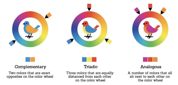
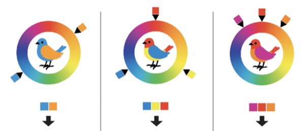
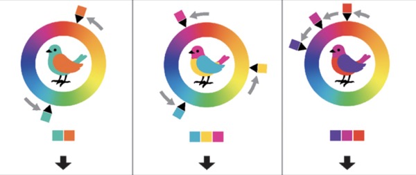
Because these color schemes are based off of color relationships, you can change them by rotating around the color wheel as much as you like, as long as the colors stay the same distance from each other.
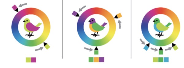
These three color relationships are classics, artists have been using them for centuries, but if we use them to strictly, our colors can look unnatural and garish.
One of the reasons some of those colors don’t look very good right now is that all of them are very saturated.
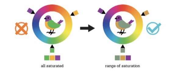
It definitely helps to have a range of saturation in a piece. But I’d like to argue that the hues in a piece should look good together regardless of their saturation. Here’s why:
People often refer to very desaturated colors like greys and browns as “neutrals” but most of the time these neutral colors still have hues, and getting those hues right can make or break a painting.
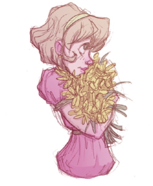
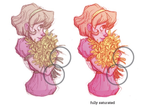
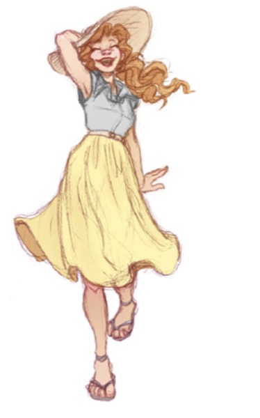
Take this drawing here. It’s got lots of neutrals and only one stand out hue. It’s almost monochromatic. Almost, but not quite.
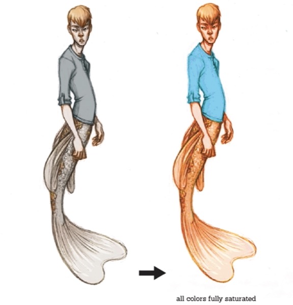
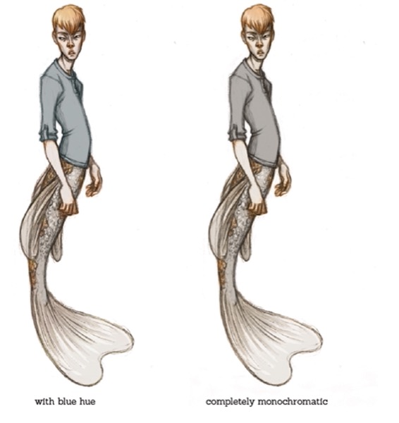
If we turn the saturation all the way up so we can see the hues of each color better, we see that the “grey” shirt actually has a blue hue, which means that this drawing actually has a very subtle complementary color scheme.
If we were to change the hue of the shirt to orange so this really was a monochromatic piece it would loose some of its life.
In this picture, on the other hand…
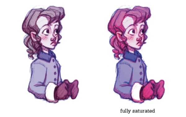
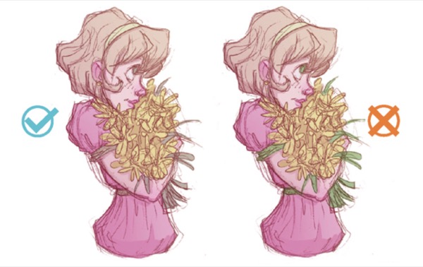
The girl’s “brown” hair is actually a very desaturated magenta. And if we were to change it to, say, this orange…
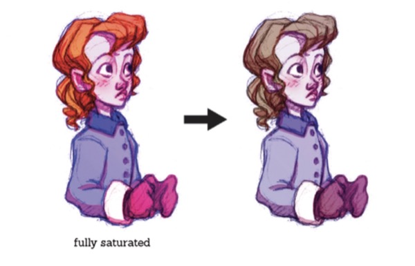
It would clash with the magenta of her skin and mittens and look bad. So how do you get your hues to work together and feel more organic? If you start with a simple color relationship like complementary colors then finding neighbors can be a good way of branching out.
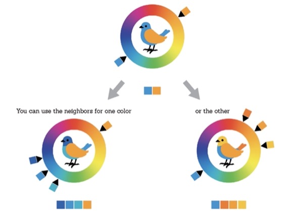
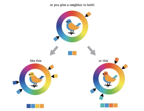
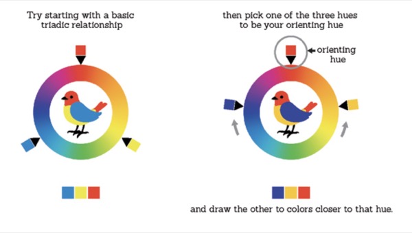
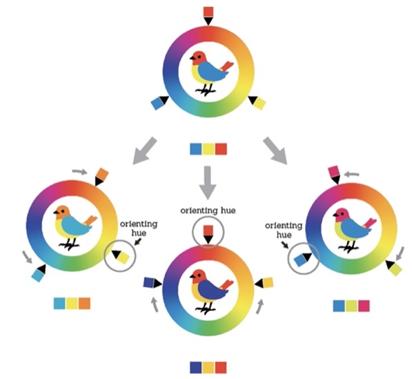
But don’t go using too many neighbors! A limited color scheme is a good color scheme. These color relationships that are based of two complementary colors and their neighbors are called “split complementary”. Another way that I like to get my hues to work together is to pick an orienting hue and use it to flavor the rest of my colors. For example:
And it works with any of the three colors in the relationship as the orienting hue.
This is the basis for what I like to think of as the “T” shaped color relationship, and I use it a lot in my work.
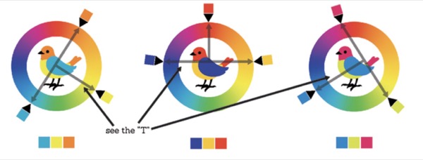
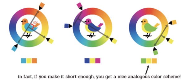
And the “T” can be as tall or short as you like, just as long as it’s got a right angle in the middle of the crossbar.
So now you have some more techniques for putting together appealing color schemes. Of course, while your doing this, keep in mind what I said earlier about limiting your hues. I’d suggest never using more than four major hues. I know that that doesn’t sound like a lot, but this is where saturation comes in.
Saturation puts a whole other dimension on your color schemes, and it can stretch or limit a group of hues in a very helpful way. Remember the stuff we learned about saturation and color relativity? This is a place where it really comes in handy.
Take this drawing for example:
Now, typically, only dead flowers have stems in that range of hues, but I didn’t want to stray from my analogous scheme.
But because of saturation and color relativity, I didn’t have to! Next to all those warm, reddish colors, a very desaturated orange actually looks green!
And using saturation instead of hue to get my “green” keeps my piece extremely unified so the focus is on the drawing and subject matter instead of making your eye dance around all the color.
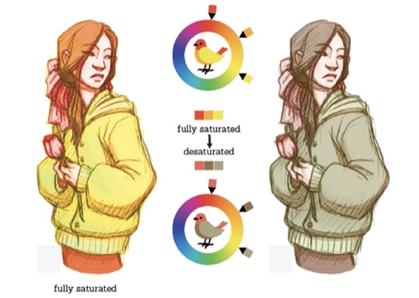
Here’s another example:
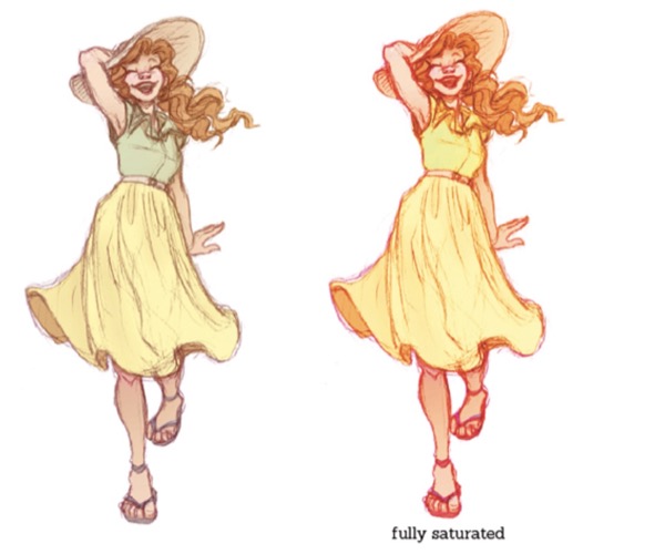
I wanted this piece to be very yellow, but I wanted the character to have a green shirt; so I used a very desaturated yellow to indicate green.
If I had desaturated it completely I could even get a blue.
This way you can get lots of colors out of a small selection of hues, and they all feel harmonious!
This brings me to another color scheme trick that I like to use; I call it the false complement. Let me show you:
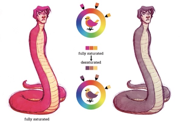
For this piece I wanted it to have the vibe of the complementary color relationship of yellow and purple, but since Curtis here is supposed to be black snake with a while belly, I didn’t want the hues to be too bold.
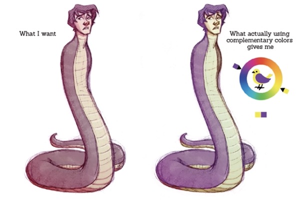
As you can see, complementary colors contrast each other so much that they can really steal the stage.
Analogous colors, on the other hand are a lot more mellow, so instead of using actual yellow and purple I used an analogous color scheme, with yellow on one end of it, and desaturated the magenta on the other end to give it a purplish feel.
Here’s another example of the same idea:
I wanted this drawing to feel like a green and red complementary relationship, but I wanted this drawing to feel very mellow.
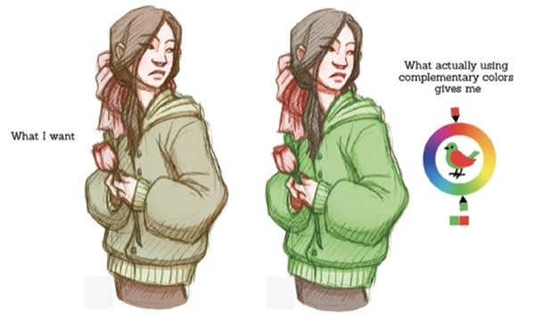
So, I used an analogous bunch of hues with red on one end, and yellow on the other and I desaturated the yellow, so that it looked like a green!
That about sums up my thoughts on color picking. I hope you found these tips and tricks helpful. If you like them and want to know more you can take a look at my other tutorials in the links below.
Thank you for reading!