

For a long time I really only understood hue and value; I had no idea how saturation affected color or why it was important. When I finally did learn about it I was suddenly able to fix a lot of the problems I had struggled with. Hopefully, I can dispel some of that mystery for you and help you understand how important saturation is and how to use it.
The first thing you need to understand is that saturation is different than hue or value.
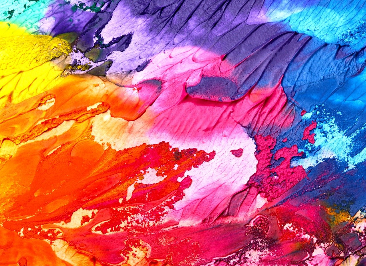
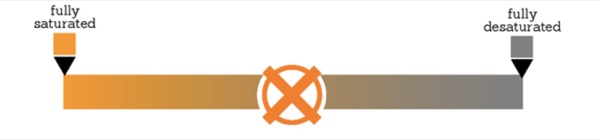
Saturation is how bright or dull a color is.
"Saturated” colors are bright and vibrant, while "desaturated" colors are dull and gray.
In fact, "gray" is a saturation, not a value or a hue. If you desaturate any hue completely, it becomes grey!
Because we’re not used to looking for it, it's easy to confuse saturation with one of the other two properties of color. In my first tutorial of this series, I explained how a change in saturation can be confused with a change in value, and how understanding this is important to making a good painting.
If you haven't read that, I highly suggest that you go and take a quick look at it.
Unfortunately, I had so much stuff to cover in my tutorial on hue that I didn't get to talk about saturation’s relationship with hue, so I want to cover that here.
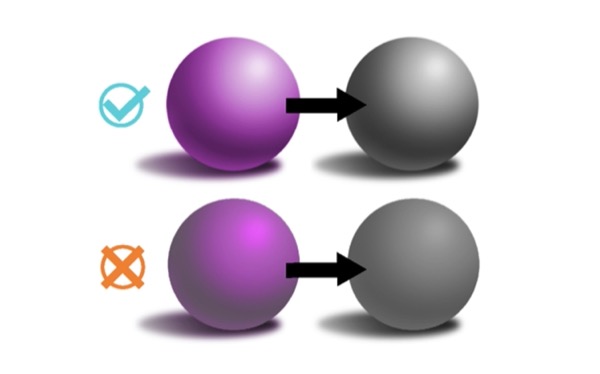
You might remember this guy: a purple ball lit with a green light.
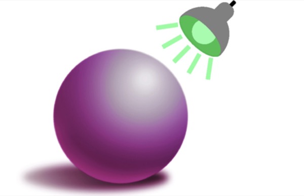
We've covered how the hue of the light affects the hue that we use to paint the light and dark sides of the ball, but I didn't get to tell you about how it also affects the saturation.
Green is on the cool side of the color wheel, so we do need to cool down the color of the light side of the ball, but that alone won't make it look like the ball has green light shining on it.
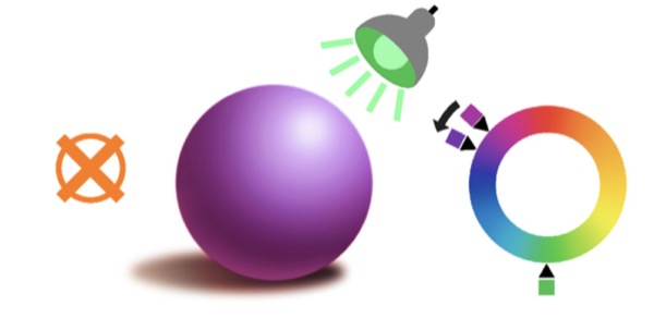
The best way to get the right color is by mixing. Obviously, since the color we're looking for is going to be used for the light side of the ball It needs to be a lighter color, but let's disregard value for a little while. If we take the purple of the ball and mix it with the green of the light we get.

A bluish-gray?
Yup! The color on the light side of this ball is a very desaturated blue, and because color is relative (like we talked about in the hue tutorial) it looks like green light in the context of the rest of the scene.
"But, Sarah, I thought we were mixing hues! Why would purple and green make a grey color?" Excellent question. Like I said earlier, grey is a saturation, not a hue, and we're working with two pretty saturated colors. So how come the result is so desaturated?
To understand that we need to look at the basics of color mixing.
Color mixing
There a few different ways to understand what happens when you mix colors, but there are two in particular that I find helpful.
Let's start with the more technical one so you can understand a little more of what's going on under the surface.
I'm sure you're familiar with the primary colors, red, blue and yellow; but do you know why they're so special?

It's because they're pure. Every other color hue can be broken down into a mix of other hues.
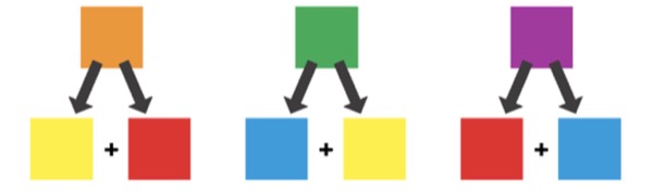
But the primary colors can't. There's no blue or yellow in red, no red or blue in yellow, and no yellow or red in blue. The three of them have nothing in common.

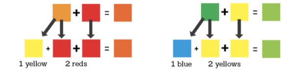
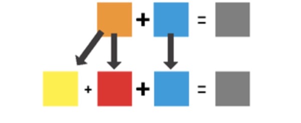
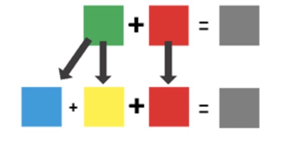
And because they have nothing in common. when you mix them together in equal parts.

The hues cancel each other out. which desaturates the color. And so you end up with grey.
What does this have to do with our purple and green? Well. when you mix two colors you're actually mixing all the colors that make them up.
So when we mix our green and purple we’re actually mixing a blue and a red, and a yellow and a blue.
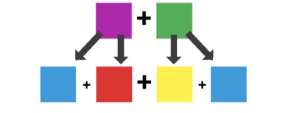
Do you see what I see here?
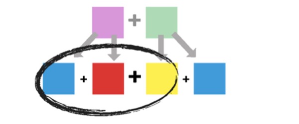
Since there are all three primary colors here you could say that
mixing a purple with a green
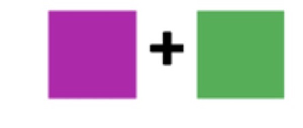
is the same as mixing a grey with a blue

Which of course gives you a bluish-gray!

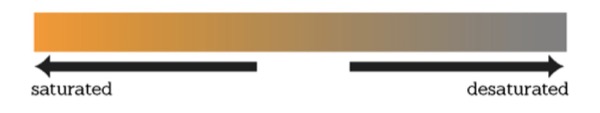
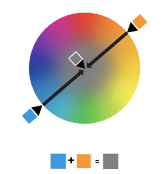
Now, I know math type things don't work very well for a lot of us artists: so here's a more intuitive way to visualize color mixing. Think of it as jumping across the color wheel. Let's fill in the middle of the color wheel with a saturation scale, so around the wheel are our hues, the outside edge is maximum saturation, and the farther into the center you go, the more desaturated you get. This of course means that the center is complete desaturation, or in other words, grey.
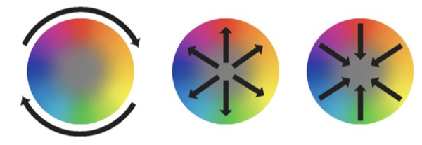
So when you mix two colors you just find the color exactly between the two.
As you can see the farther apart two colors are around the wheel, the more desaturated the result is. And as we know from the addition method above, this is because they have less in common.
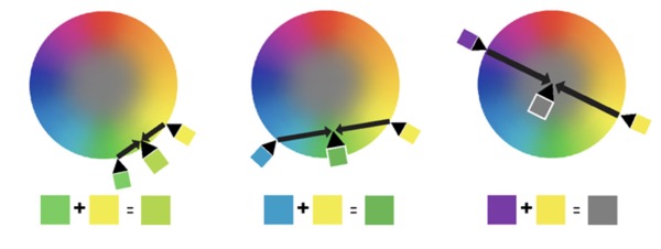
And when we do our purple and green we get a bluish-gray.
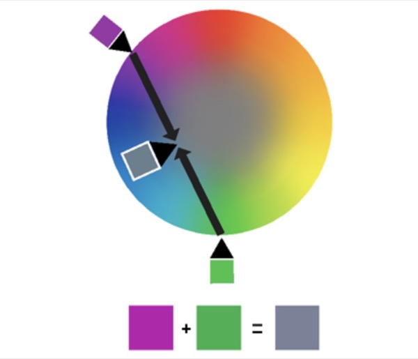
So now you know why you'd paint a purple ball under green light with grey, but even more importantly, you now have the tools to understand what, in my opinion, is the most useful thing to know about saturation: when you mix a color with Its complement, you're just desaturating it. Look, I'll show you:
When you mix two complementary colors you're actually mixing all the primary colors together
So you get grey.
Or, using the color wheel method:
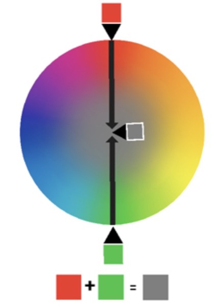
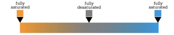
Complementary colors are exactly opposite from each other on the color wheel, so if you mix them they will always meet in the exact middle: at grey.
So you could say that instead of saturation being a scale between a fully saturated color and grey
It's actually a scale between two fully saturated complementary colors.
Why is this so important? Because even though saturation and hue are separate properties of color, they often work in tandem. And with the magic of color relativity, you can get a lot of color out of saturation alone.
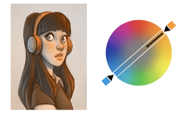
This painting has only one hue in it: orange. But because desaturating the orange is like bringing it closer to blue, the desaturated parts almost look blue next to the more saturated oranges. So you can do a painting that has warm light and cool shadows (or the inverse) with only one hue in it!
So, that's my two cents on saturation. I hope you found these tips and tricks helpful. If you liked them and want to know more you can take a look at my other tutorials.
Thank you for reading!